Fewer wrong leads, more conversions
A 4-question quiz before the form, so that only people Stannah can actually help ask to be contacted. We were willing to lose conversions in exchange for better leads. The A/B test showed the opposite.
- My role
- UX/UI design, CRO and implementation
- Market
- Portugal
- Audience
- Older adults and their families
- Tools
- Figma · Unbounce · HTML, CSS and JS
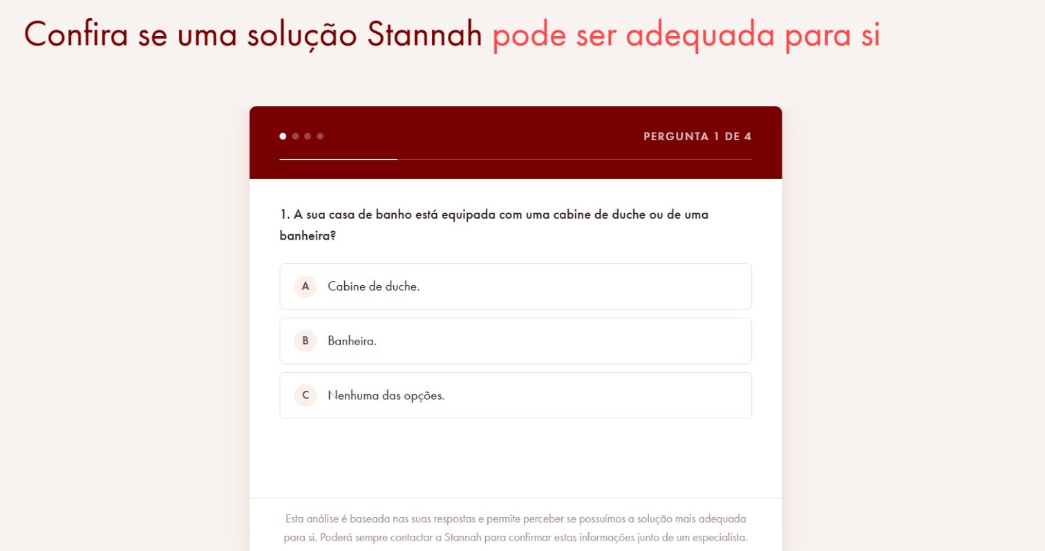
Many leads weren't qualified: their bathroom didn't suit Stannah's products, or they were looking for something else.
A short quiz, one question at a time, that tells people whether Stannah is the right fit before they ask to be contacted.
More qualified leads and, against expectations, a higher conversion rate. Validated with an A/B test.
Context and problem
Stannah replaces bathtubs and shower trays with safer, more accessible bathing solutions. The landing page generated leads, but a significant share of them couldn't go anywhere.
There were two kinds of lead the team couldn't help: people whose bathroom didn't suit the products, and people looking for something else, such as a full bathroom renovation.
Every unqualified lead meant sales time spent on a call that led nowhere and, for the person on the other end, an expectation that wouldn't be met.
Hypothesis and risk
If people answer 4 simple questions before the form, only those Stannah can help will ask to be contacted. Lead quality goes up.
We knew there was a risk: every extra step before a form usually lowers conversion. We took that risk on purpose. We'd rather have fewer leads, as long as they were better ones.
So we wouldn't decide on gut feeling, the solution would be validated with an A/B test: the page with the quiz against the page without it.
The 4 questions
Each question maps to a criterion that, in practice, decided whether a lead could go anywhere. No questions "just to know more": if it didn't help qualify, it didn't go in.
Is your bathroom fitted with a shower or a bathtub?
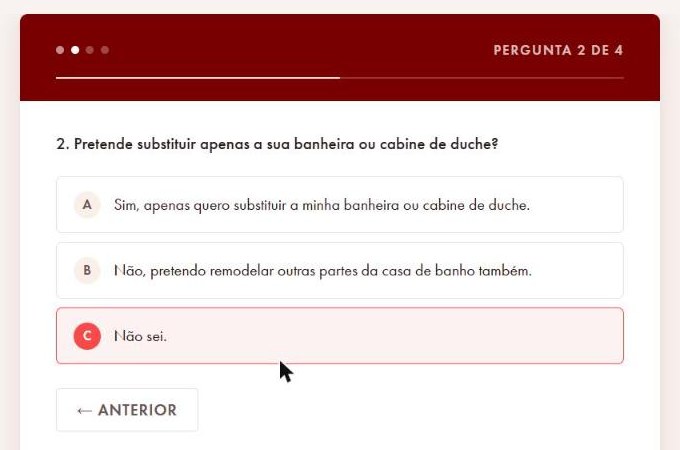
What the person already has: Stannah replaces existing bathtubs and showers.Do you only want to replace your bathtub or shower?
The type of service: Stannah doesn't do full bathroom renovations.When do you need your bathing solution?
Urgency: it helps the team see how to prioritise each lead.Are you looking for a solution with more support and safety when bathing?
The need: the solutions are designed for people with reduced mobility.
Questions translated from the original Portuguese.
Design decisions
One question at a time, with visible progress
For an older audience, seeing all four questions at once feels like a long form. One at a time feels like a conversation. The "Question 2 of 4" counter and the progress bar show there's not much left.
Ruled out: all the questions on a single page. Faster to build, but more intimidating.
Closed answers, always with "I don't know"
Three large, easy-to-tap options and no text fields. The "I don't know" option stops people dropping out just because they're not sure.
Ruled out: yes/no answers only, which forced people to choose even when they had doubts.
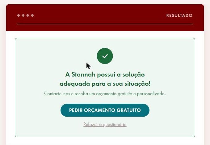
A result that explains, not a flat "no"
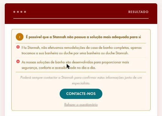
When Stannah isn't the right fit, the result says why, based on the answers given (for example: "we don't do full renovations"). The door stays open: people can always speak to a specialist.
Ruled out: hiding the form from unqualified visitors. Better at filtering, but frustrating and not transparent.
A single action in the hero: "Take the test now"
The main hero button takes people straight to the quiz. The language is plain and direct, with no other actions competing for attention.
Behaviour on the page
The page was meant to draw attention to two points: the quiz and the form. The hero button takes people straight to the quiz, and the form appears as the natural next step for anyone who gets a positive result.
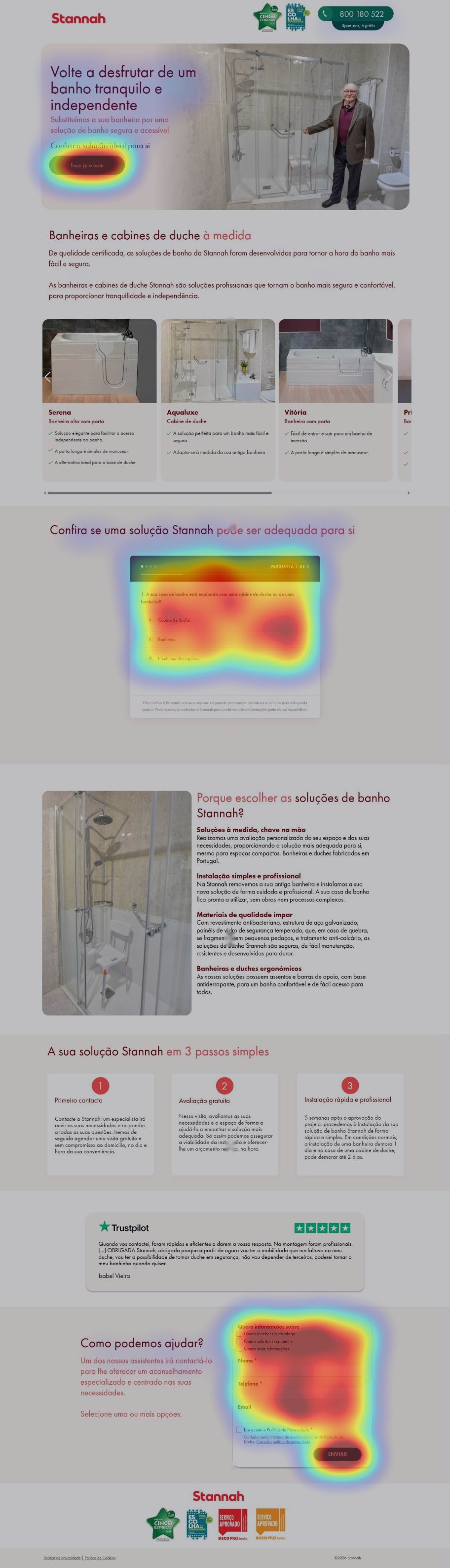
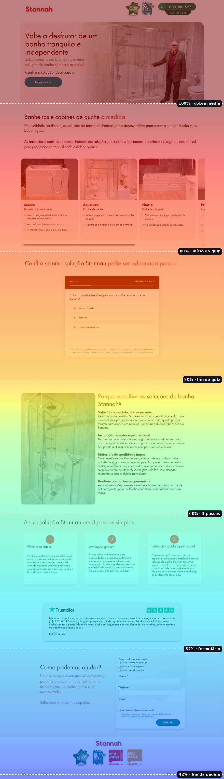
Illustrative representation, created for this portfolio from the real page. It doesn't show real user data.
A/B test and result
We ran both versions of the page as an A/B test: the original, with the form straight away, and the new one, with the quiz before the form.
The quiz version didn't just bring in more qualified leads, it also converted better than the page without the quiz.
Our reading: the quiz didn't only work as a filter. It also informed people. By the time they reached the form, they already knew Stannah had a solution for their situation, so asking to be contacted felt like a safe step rather than a leap in the dark.
What I learned
- One more step doesn't always mean fewer conversions. If the step gives people something of value, it can increase them.
- For an older audience, transparency ("this is for you" or "this isn't for you, and here's why") builds more trust than a generic form.
- It's worth testing the hypotheses we feel most sure about. Here, the risk we accepted never even materialised.